Plotting summary stats
The ggplot fanciness we covered in Lesson 1 and Lesson 2 is great, but sometimes your boss/grant agency/publication outlet insists on a bar or column graph. Or perhaps you simply need to visualise two continuous variables. In this lesson, we will show you how to plot bar and column graphs with error bars and how to plot a scatter plot.
Lesson Outcomes
By the end of the lesson, you should be able to :
- use
geom_barandgeom_colto plot frequency vs. summary data - use
summariseto calculate standard error andgeom_errorbarto add error bars to a plot - use
geom_pointto create a scatter plot of two continuous variables
3.1 Bars vs. columns
There are two geoms in ggplot that draw bar plots, geom_barand geom_col.
When you want to plot frequency/count data and are happy to let R to do the counting autoamtically, use geom_bar. It only requires that you tell it what you want on the x axis, and it will put frequency on the y axis.
If you want the height of the bar to represent a value you have calculated, then use geom_col. For this geom, you need to tell it what you want for both the x axis and the y axis.
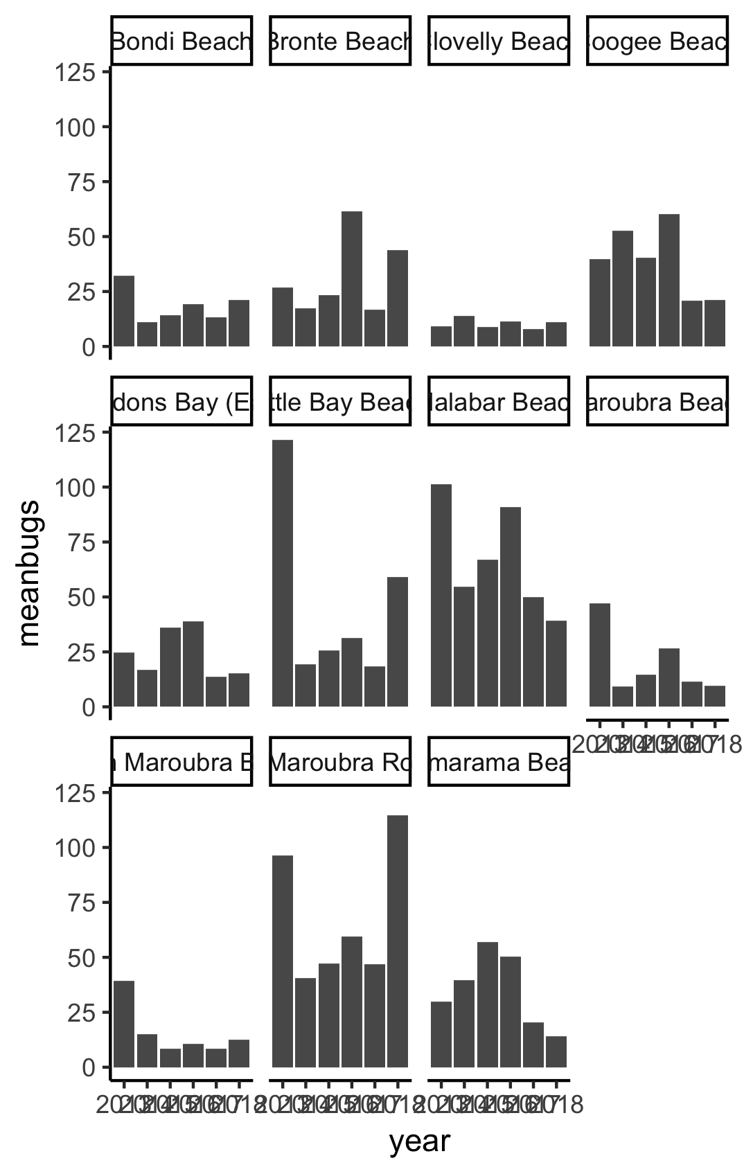
In this screencast, we’ll review:
- How to use
geom_barto plot count/frequency data - How to combine
summariseandgeom_colto plot mean bug levels by year - How to
group_bymore than one variable and usefacet_wrapto plot mean bug levels by year, separately for each site
Here’s the plot for reference:
Your turn to have a go
Watch the video and then carry out the following steps:
- Use
geom_barandfacet_wrapto plot the number of readings that were taken each year, separately for each site - Use
group_byandsummarisewithgeom_colto plot the mean beach bug levels averaged across all the sites each year - Use
group_byandsummarisewithgeom_colto plot the mean beach bug levels each year, usingfacet_wrapto plot each site separately
Error bars
Of course, good practice dictates that you need error bars on those columns. Never fear! Using summarise, it is easy to calculate standard error.
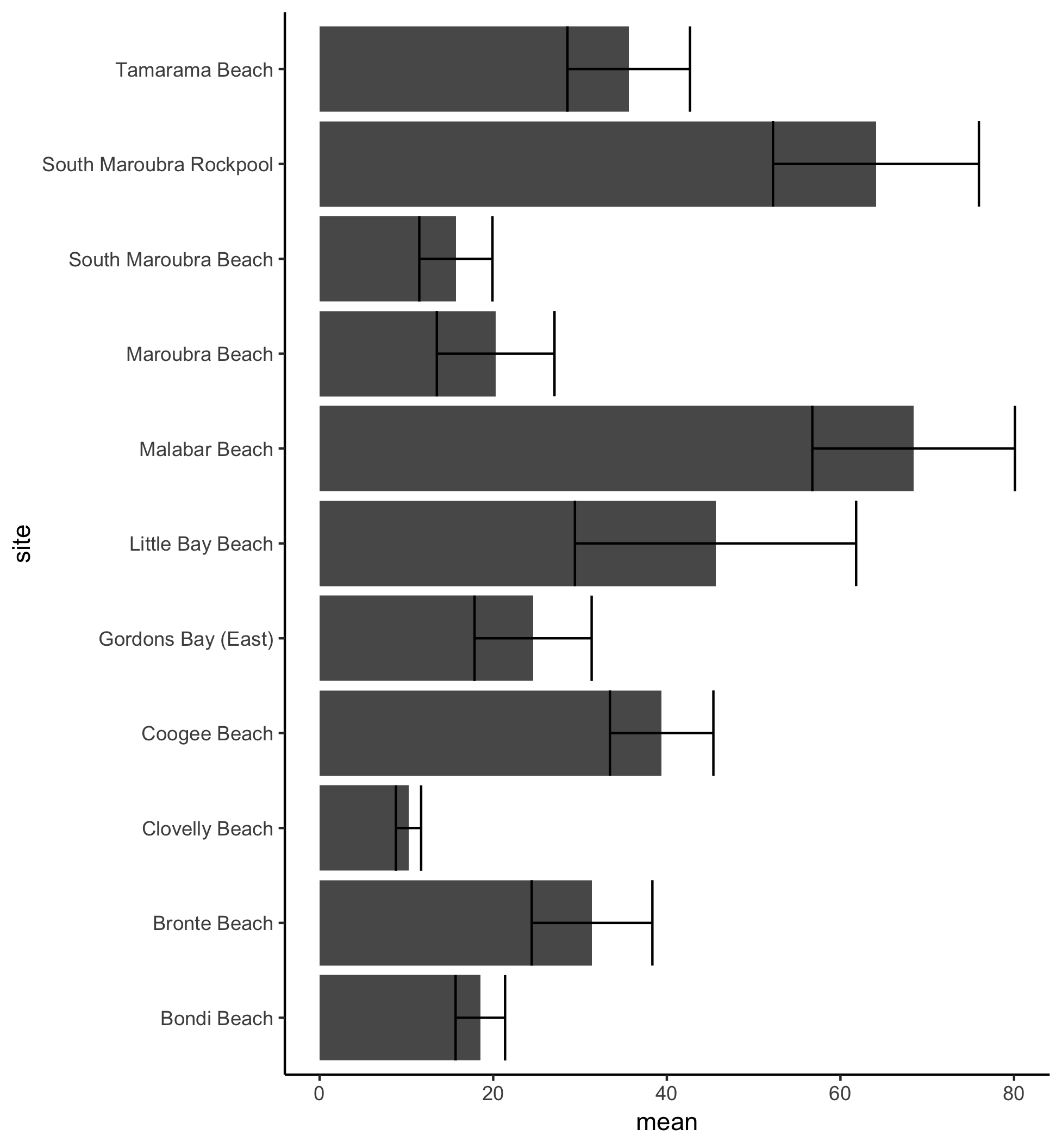
In this screencast, we’ll review:
- How to use
summariseto calculate the mean, standard deviation and standard error - How to add a
geom_errorbarlayer to your plot to display the mean beach bugs data in a column graph with error bars
Here’s the plot for reference:
Your turn to have a go
Watch the video and then carry out the following steps:
- Use
group_byandsummariseto calculate the mean, standard deviation, N, and standard error for each site - Pipe that
summariseinto ageom_coladding acoorid_flipandgeom_errorbarlayer
Scatter plots
Sometimes you want to visualise the relationship between two continuous variables using a scatterplot. Our original beachbugs dataset doesn’t include any interesting variables that might be correlated with the bacteria levels, so we have pulled in some weather data to see whether bacteria levels might be related to rainfall or temperature, or some combination of the two.
You can download the rain_temp_beachbugs.csv data here
Don’t forget that #RYouWithMe has a data package and that you can use it to get the rain_temp_bugs data
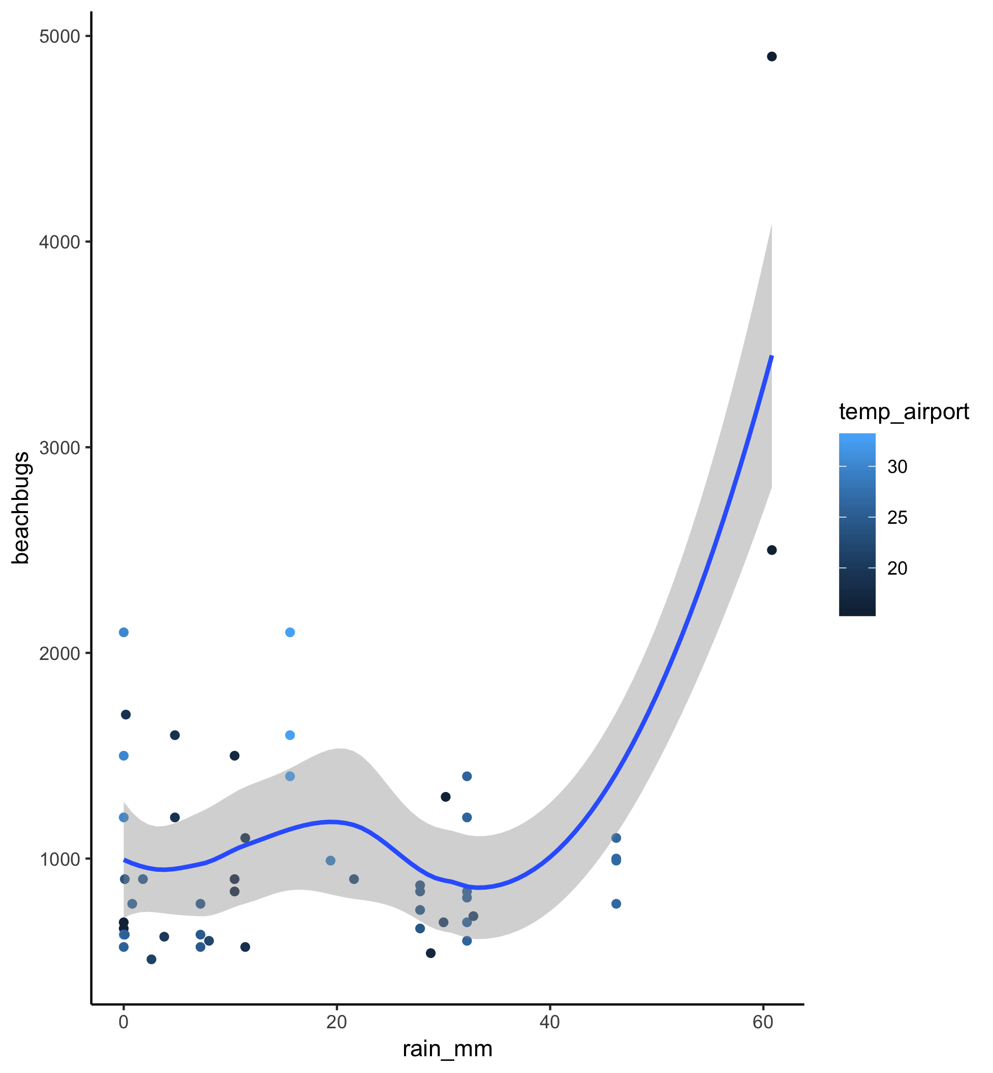
In this screencast, we’ll review:
- How to import the rain_temp_beachbugs.csv dataset into R
- How to use
geom_pointandgeom_smoothto plot a scatter plot and best fit line - How to use point color to illustrate potential interactions in your data
Here’s the plot for reference:
Your turn to have a go
Watch the video and then carry out the following steps:
- use
read_csvandhereto read the rain_temp data into RStudio (need help? revisit Unit 1 Basic Basics Lesson 3: Loading Data - use
geom_pointto plot the relation between rainfall and beach bugs filterthe data for values more than 500 and add ageom_smoothlayer to see a regression line- colour the points by the temperature variable
Now that you’ve got the structural components of several of the most popular plots down, it’s time to learn how to customise the appearance of those plots! Onward to Lesson 4.