Plotting distributions
When you want to capture the distribution of your data in a plot, without getting too far away from the raw data, box and whisker plots, violin plots, and histograms are likely to be useful. In this lesson, we’re tackling how to creat these plots using various geom commands!
Lesson Outcomes
By the end of the lesson, you should be able to:
- use
geom_boxplotandgeom_violinto plot the distribution of raw data - use
geom_histogramto eyeball whether your data is normally distributed - layer more than one geom to gain extra insight about the distribution of your data
Boxes and violins
I don’t think I have used a box plot since primary school. In fact, I had to google what the lines on the box represent. Definitely check out the ggplot documentation here and ignore me when I try and convince you in the video that the interquartile range represents 75% of the data; it’s definitely 50%.
Boxplots are so 1980 anyway; boxplots are out and violin plots are in.
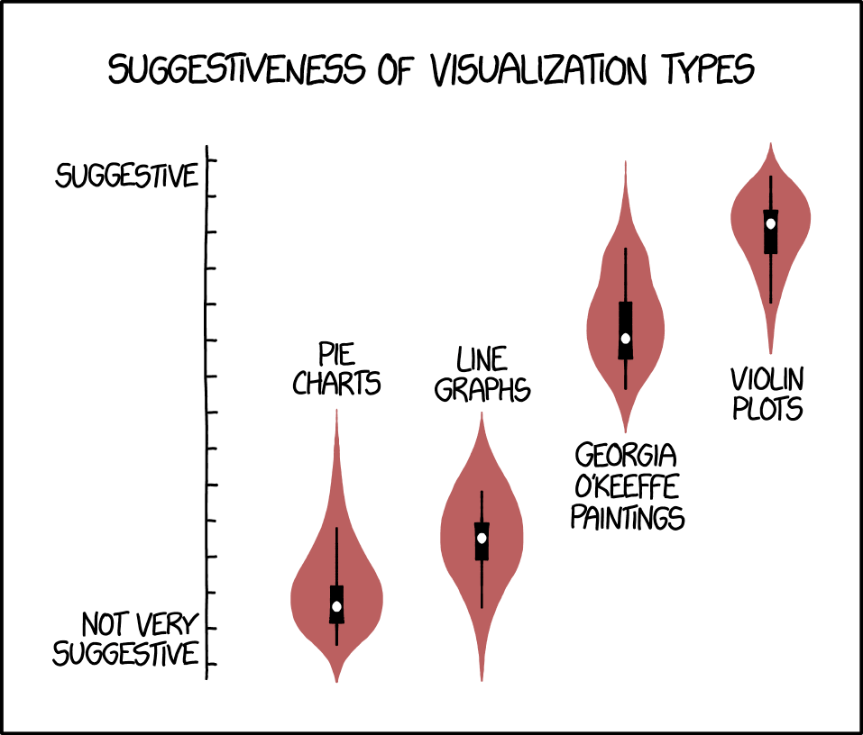
Image credit: https://xkcd.com/1967/
In this screencast, we’ll review:
- How to use
geom_boxplot - How to use
geom_violin - How to combine these geoms with
filterandfacet_wrap - How to use the colour and fill aesthetics
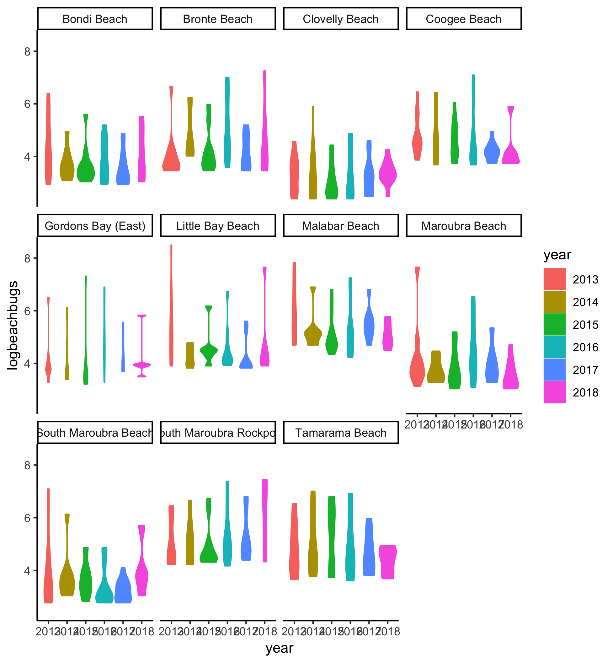
Here’s the plot for reference:
Your turn to have a go
Watch the video and then carry out the following steps:
- Use
geom_boxplotto plot the log-transformed buglevels by site - Use
geom_violinto plot log-transformed buglevels by year - Use
filterto only plot buggier than average days and add afacet_wrapto look at the violin plots for each site separately - What happens when you filter for buggier_all? Does that change your plot?
- Play around with colour and fill aesthetics. Do they work on the
geom_boxplottoo?
Helpful hint: You can find ggplot documentation about violin plots here
Histograms
Often the quickest way to get an idea of whether your data is normally distributed is to plot a histogram. Let’s learn how to do that.
In this screencast, we’ll review:
- How to use base graphics to get a quick and dirty histogram
- How to combine
filterandgeom_histogram - How to alter the bin_width in
geom_histogram
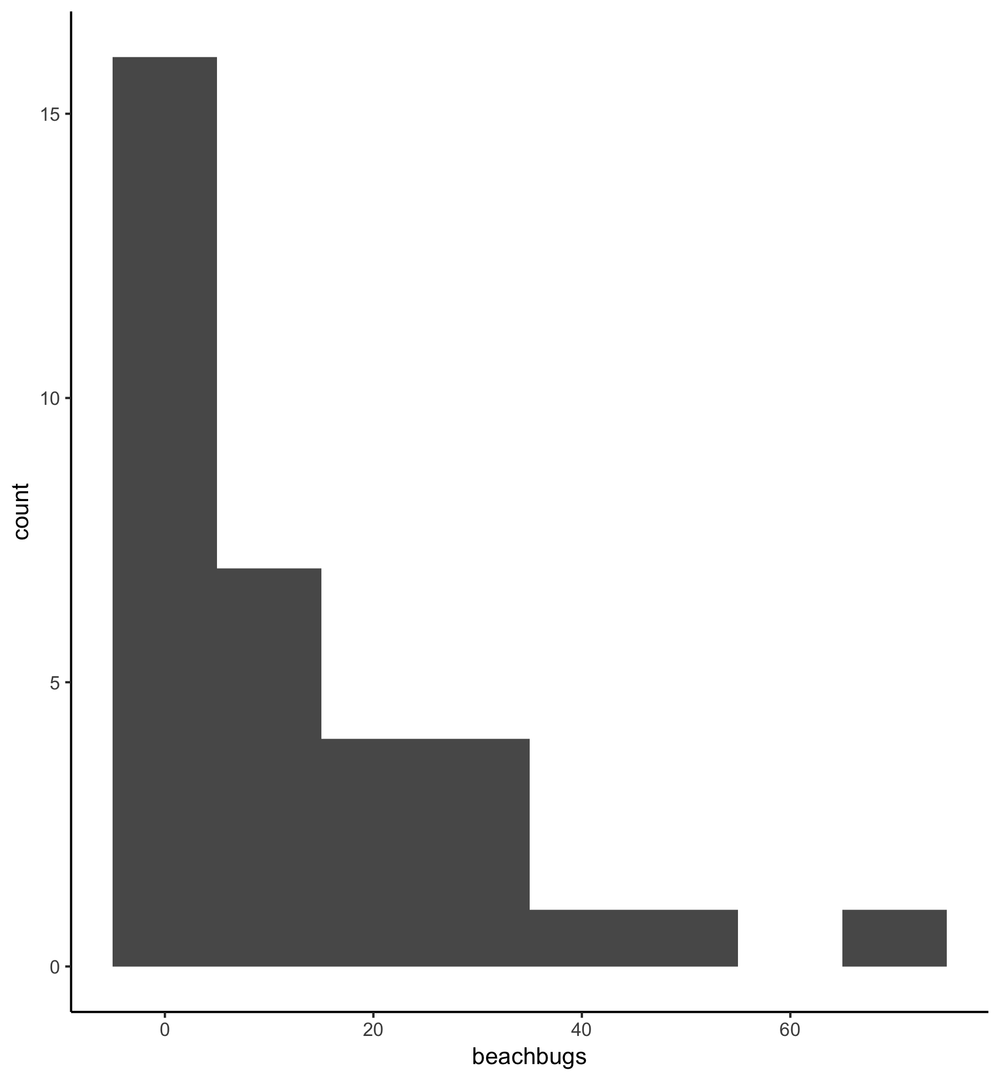
Here’s the plot for reference:
Your turn to have a go
Watch the video and then carry out the following steps:
- Use base graphics to plot the log transformed beachbugs data in a histogram. Does that look better?
- Use
geom_histogramto plot log-transformed buglevels for Clovelly in 2018 - Compare this plot to one that uses the raw rather than log-transformed data. What is the most appropriate bin_width for this raw data?
Combination plots
Each time you add a + to a ggplot, you are adding a layer, and there is no reason why those layers can’t be extra geoms!
In this screencast, we’ll review:
- How to layer
geom_boxplot,geom_violin, andgeom_pointto create combination plots
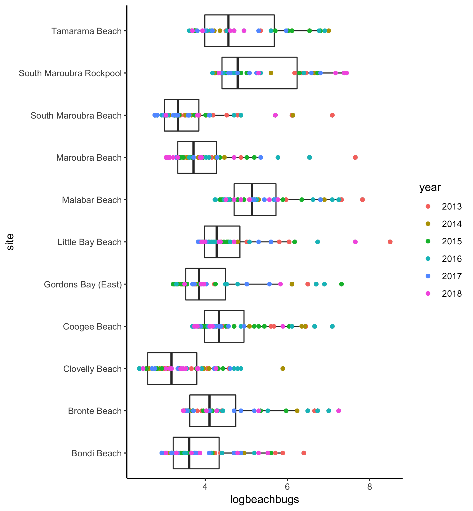
Here’s the plot for reference:
Your turn to have a go
Watch the video and then carry out the following steps:
- Filter for days that are buggier than average and then plot the log transformed beach bugs values for each site by combining
geom_boxplotandgeom_point - Use
geom_violinto plot the log transformed beach bugs values and layer geom_points; this time try colouring by council
ggplot inspo
Check out the results of a google image search for ‘ggplot violin’ here to get inspired!
Now, apply that inspiration to your own data! Don’t forget ggsave() from VizW(h)iz 1 so you can show others your fantastic outputs!
We all know there are times when you need (read: are forced) to create boring bar or column plots! That’s what Lesson 3 is for! We also cover scatterplots, so all is not for naught! Head on to Lesson 3)!