VizWhiz 4
I google for #rstats code all the time! https://t.co/XDzuvqkJCK
— Hadley Wickham (@hadleywickham) July 26, 2016
Everyone (even Hadley Wickham!) googles how to make their ggplot look like how they want, every…. single…. time. In this lesson, we are going to show you how to use themes, colours, and labels to get most of the way there.
Lesson Outcomes
By the end of the lesson, you should:
- 4.1 Be able to use
ggplotthemes to change most of the things you don’t like about your plots - 4.2 Know how to change the colour of points on your plot manually and using palettes
- 4.3 Add labels to your plot to ensure that it is clear to the view what you are plotting
4.1 ggplot themes
The default plots in ggplot come with a grey background and gridlines, but you can add a “theme” as another layer to your plot to deal with a lot of the format setting issues automatically.
Want to get rid of the grey background? Try + theme_bw()
Want old-school solid black x and y axes with no gridlines? Give theme_classic() a go, (or try the cowplot package)
In this screencast, we’ll review:
- how to add a theme to a single plot
- how to change the default at the top of your script so that all of your plots have the same theme
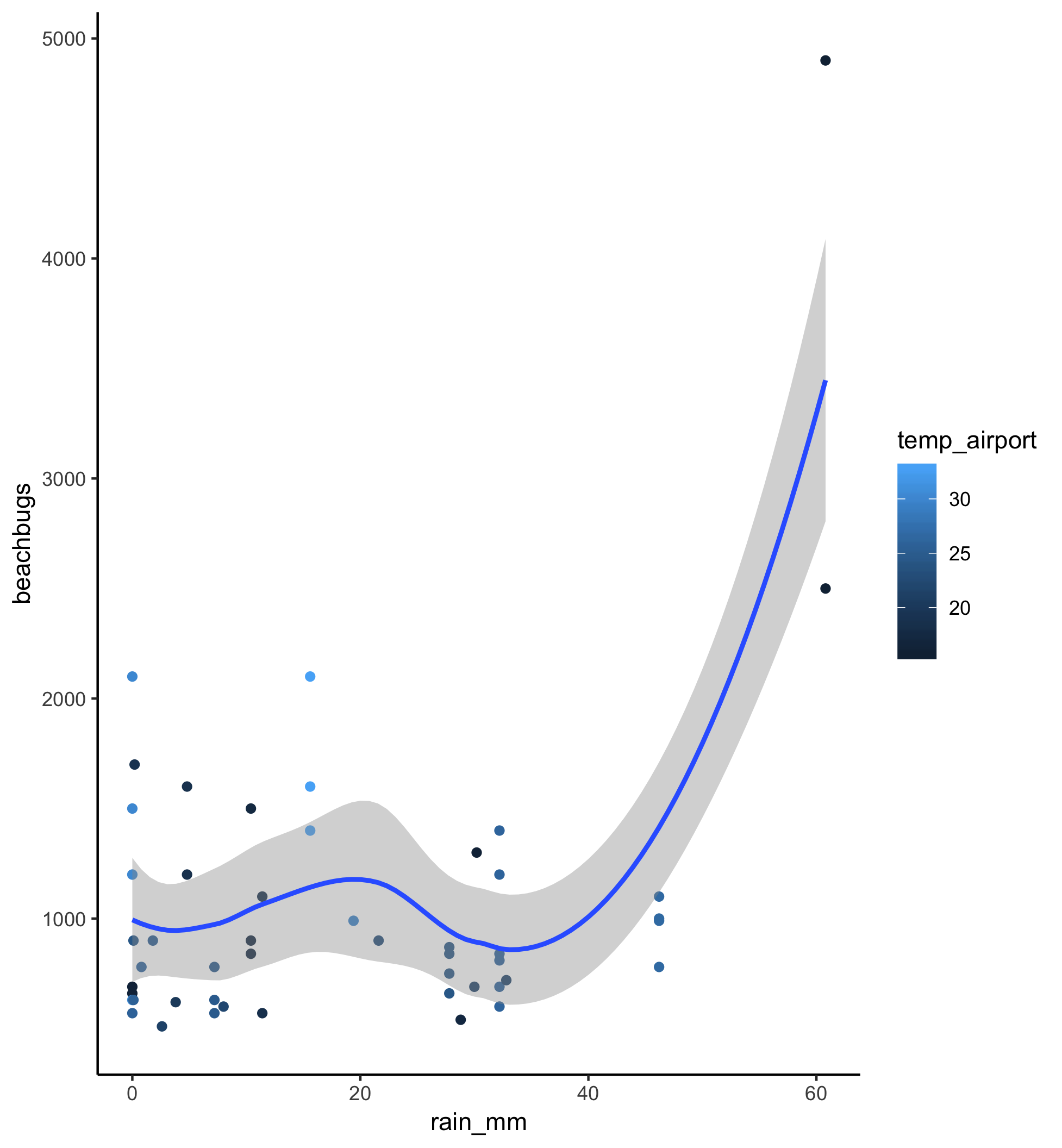
Here’s the plot for reference:

Watch the video and then carry out the following steps:
- add a theme layer to the rainfall/temperature plot
- try a few different themes and work out which one you like the best
- add a
theme_setcall at the beginning of your script and then run the whole script to see what the all of the figures look like with the new theme
Helpful hint: For more information about using ggplot themes, check out the documentation here.
4.2 Playing with colours
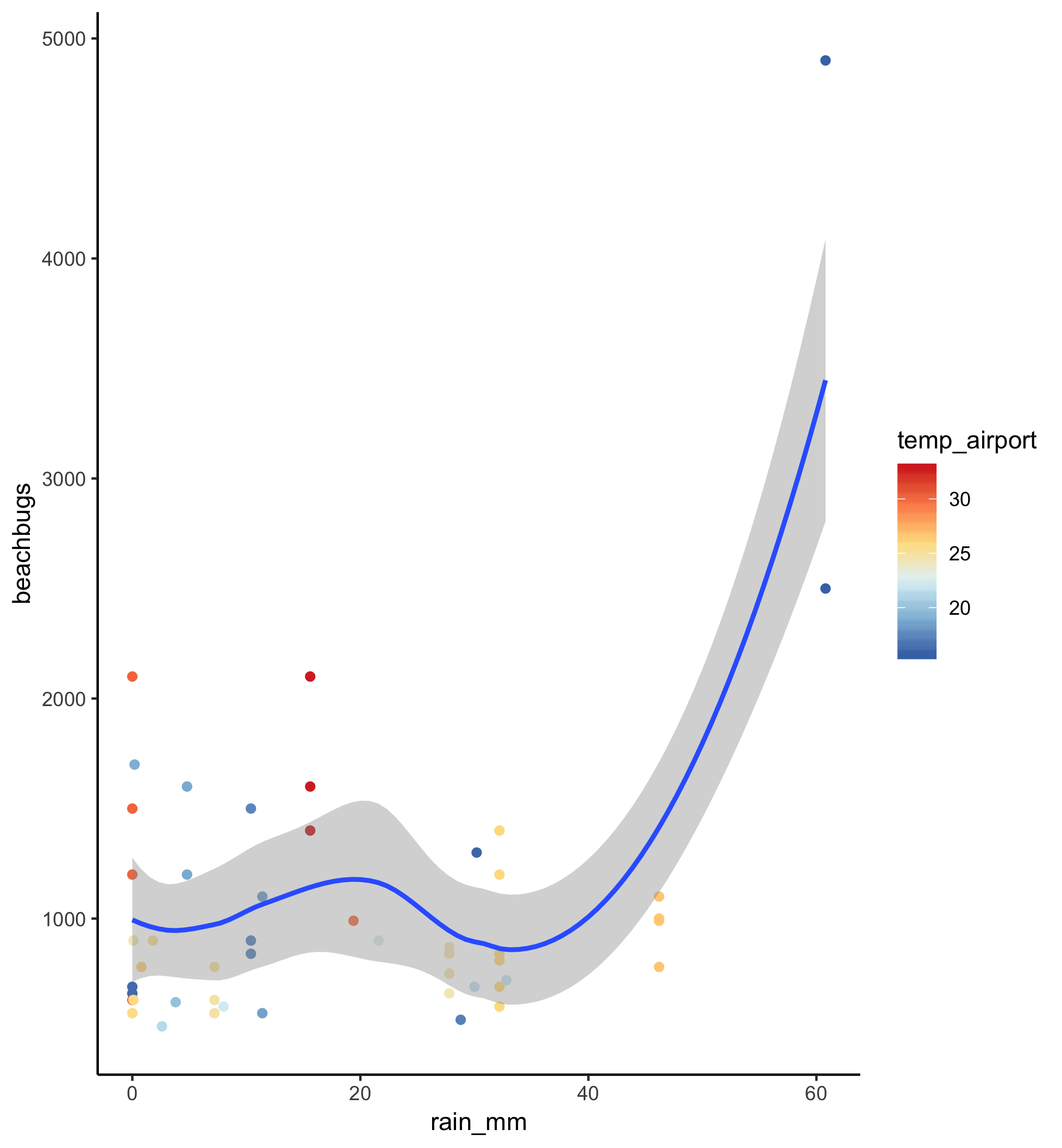
In our rainfall/temperature plot, the default colour scheme for differentiating temperature is blue on blue on blue. It would be great if we could make hot days display as red points and cool days as blue points. Let’s learn how to do that.
In this screencast, we’ll review:
- how to add change the colour of the points using
scale_colour_gradient - how to add change the colour of the points using palettes from the
RColorBrewerpackage
Here’s the plot for reference:

Watch the video and then carry out the following steps:
- Change the colour of your points to make cool values blue and hot values red using
scale_colour_gradient - Install the RColorBrewer package and call
display.brewer.allto pull up all the palette options - Choose your favourite brewer palette and use it to change the colour of the points with
scale_colour_distiller
Tips for working with palettes.
- When using colour palettes, the
scale_colour_distillerfunction works well for continuous data, where you want a gradient of colour from low to high values. When using colour palettes to change the colour of bars (i.e., you want discrete colours) apparently you want to usescale_colour_brewer()instead. See more info about the RColorBrewer package here. - The palettes in the RColorBrewer package are only a drop in the bucket of colour options. There is a package called
wesandersonthat has created palettes from Wes Anderson films that might also be of interest!
4.3 But what are you plotting?
When making data visualisations it is also really important that your audience can quickly disgest what they are looking at; labels are key.
In this screencast, we’ll review:
- how to use the
labslayer in ggplot to add a title, subtitle, and caption to your plot - how to change the x and y axis labels
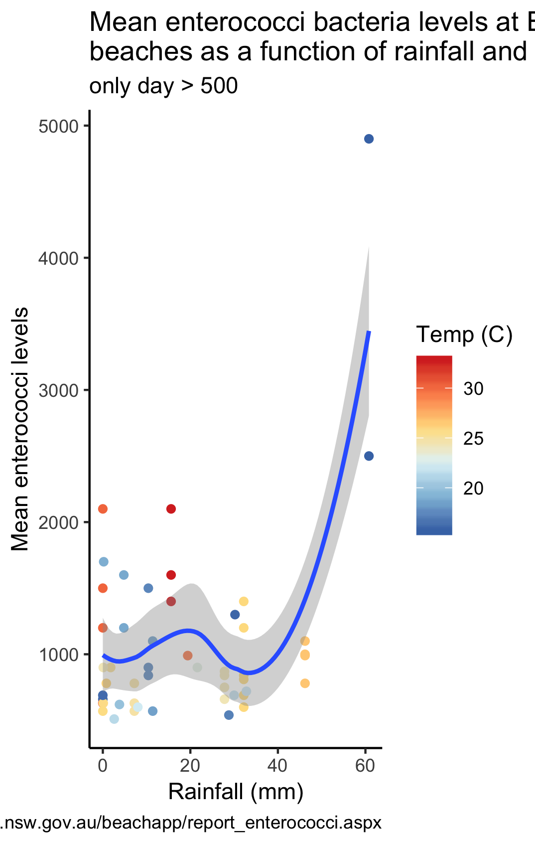
Here’s the plot for reference:

Watch the video and then carry out the following steps:
- Add a title and subtitle
- Add a caption that reflects where the data came from
- Change the x and y axes so that they more accurately capture what is plotted
Helpful hint: For more information about how to use labs, see the ggplot documentation here.
P.S. I googled it and worked out how to make the title wrap over the line. Just put "\n" into the title where you want it to wrap.
like this…
labs(title = "Mean enterococci bacteria levels at Eastern Suburbs \nbeaches as a function of rainfall and temperature")
P.P.S. I also worked out how to change the label on the legend, just add "name =" to the scale_colour_distiller call, like this…
scale_colour_distiller(name = "Temp (C)", palette = "RdYlBu")
P.P.P.S. I don’t know how to move the caption! If you work it out, let me know on Twitter using #vizwhiz and tagging @RLadiesSydney!
You guessed it! It’s your turn!
Pick your favourite figure from your own work and try to replicate it in R. Don’t forget that EVERYONE googles how to do EVERYTHING. Also make sure to add ggsave to share your plots - on Twitter (use the hashtag #vizwhiz and tag us @RLadiesSydney) or, for Sydney-based R-Ladies, on Slack in the #ryouwithme_3_vizwhiz channel.
Next up, a bonus lesson - adding GIFs to plots!